Track Slowdowns and Spot Pages That Need a Refresh With the Content Decay Content View
- Support Center
- Opportunities
Track Slowdowns and Spot Pages That Need a Refresh With the Content Decay Content View
The Content Decay Content View makes it simple to monitor traffic slowdowns across your published pages. By surfacing recent performance data alongside seasonal comparisons, the view helps you distinguish between natural fluctuations and genuine decay - and decide where to focus your refresh efforts.
Why Content Decay Matters
Content rarely stops performing overnight — it softens gradually. The Content Decay view crystallizes those slowdowns, showing you where a modest refresh can recover clicks and strengthen authority.
By prioritizing pages with confirmed decline, you invest effort where it’s most likely to produce quick, measurable gains without rebuilding from scratch. The Content Decay Content View is your launchpad for keeping published content fresh, relevant, and competitive.
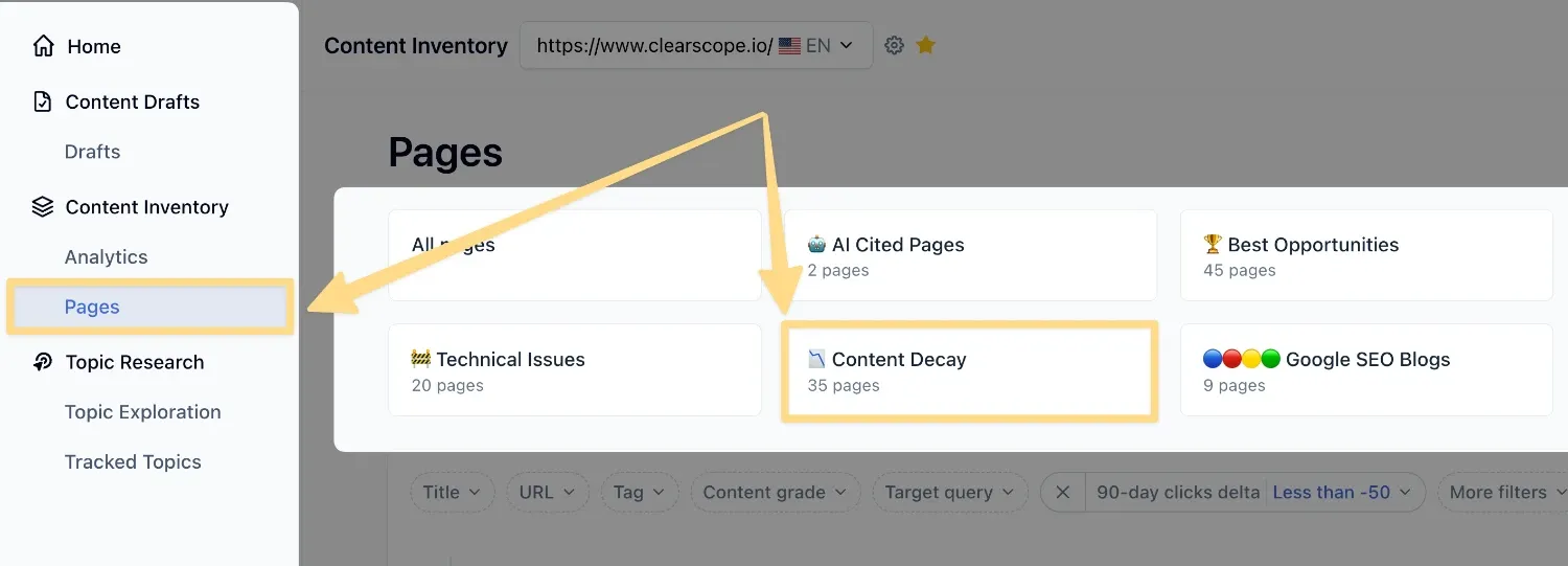
How To Access Your Content Decay View
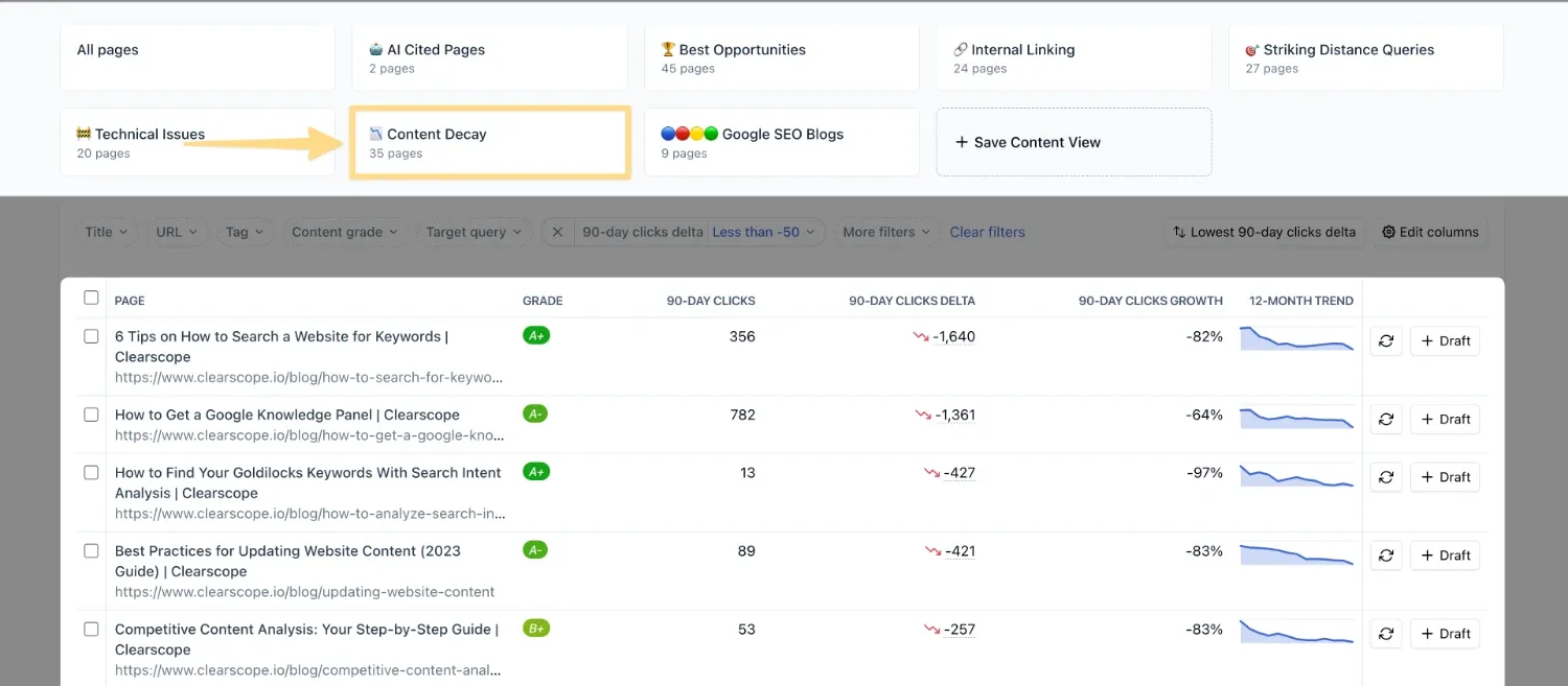
From your Content Inventory, select the Content Decay view from the starter views at the top of the page. You’ll see a filtered list of pages with their associated metrics, giving you a clear picture of which pieces are holding steady and which may be slipping.
How to Use the Content Decay View
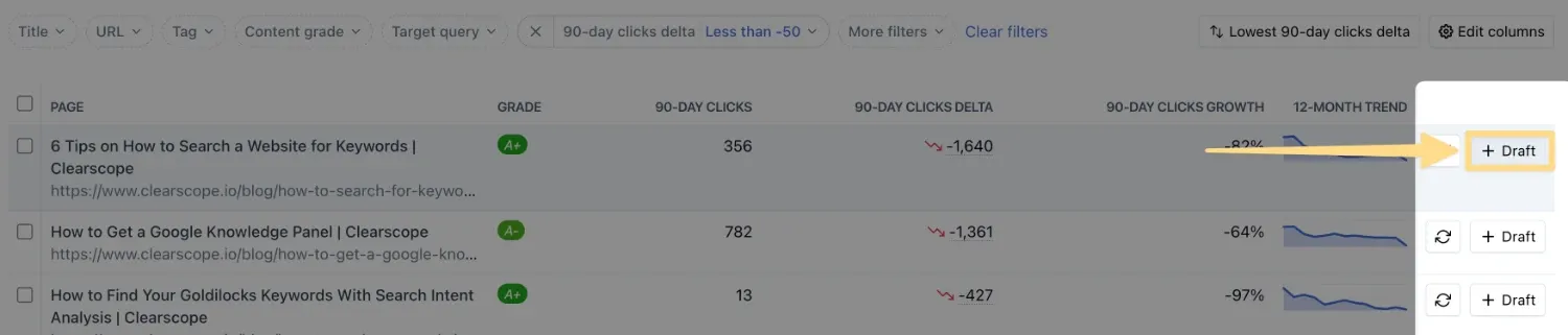
Pages in your Content Decay Content View showing negative seasonal difference and negative seasonal growth, especially when the 12‑month sparkline confirms a downward trend, are strong candidates for a refresh.
Updating outdated sections, expanding topical coverage, or improving alignment with user intent can help reverse the decline. If a page clearly needs work, you can generate a Clearscope Draft directly from the view to get targeted recommendations on topical coverage, phrasing, and structure.
Understanding the Content Decay View
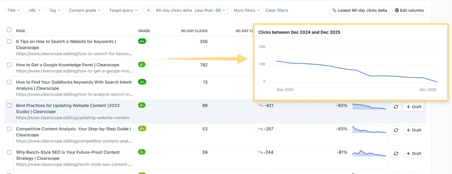
Each page in the Content Decay Content View is paired with its URL and a set of performance metrics designed to highlight change over time.
You’ll see the total clicks earned in the last 90 days, along with a seasonal comparison to the same 90‑day window from the previous year. The difference between those two periods is displayed as a raw number and as a percentage, making it easy to spot growth or decline at a glance. A sparkline trend line shows the last 12 months of activity, giving you context for whether a slowdown is part of a longer pattern or a short‑term dip.
For example, if a page earned 300 clicks from April 18 through July 18 this year and 200 clicks in the same window last year, the seasonal difference would be +100 and the seasonal growth +50%. Positive numbers indicate growth, while negative numbers suggest potential decay worth investigating further.